Shapes Design is my own homeware studio, and its identity was built as a complete system: a geometric pattern language, a minimal typographic voice, and a product range where every touchpoint, from the calendar grid to the shipping box, follows the same rules.
The system
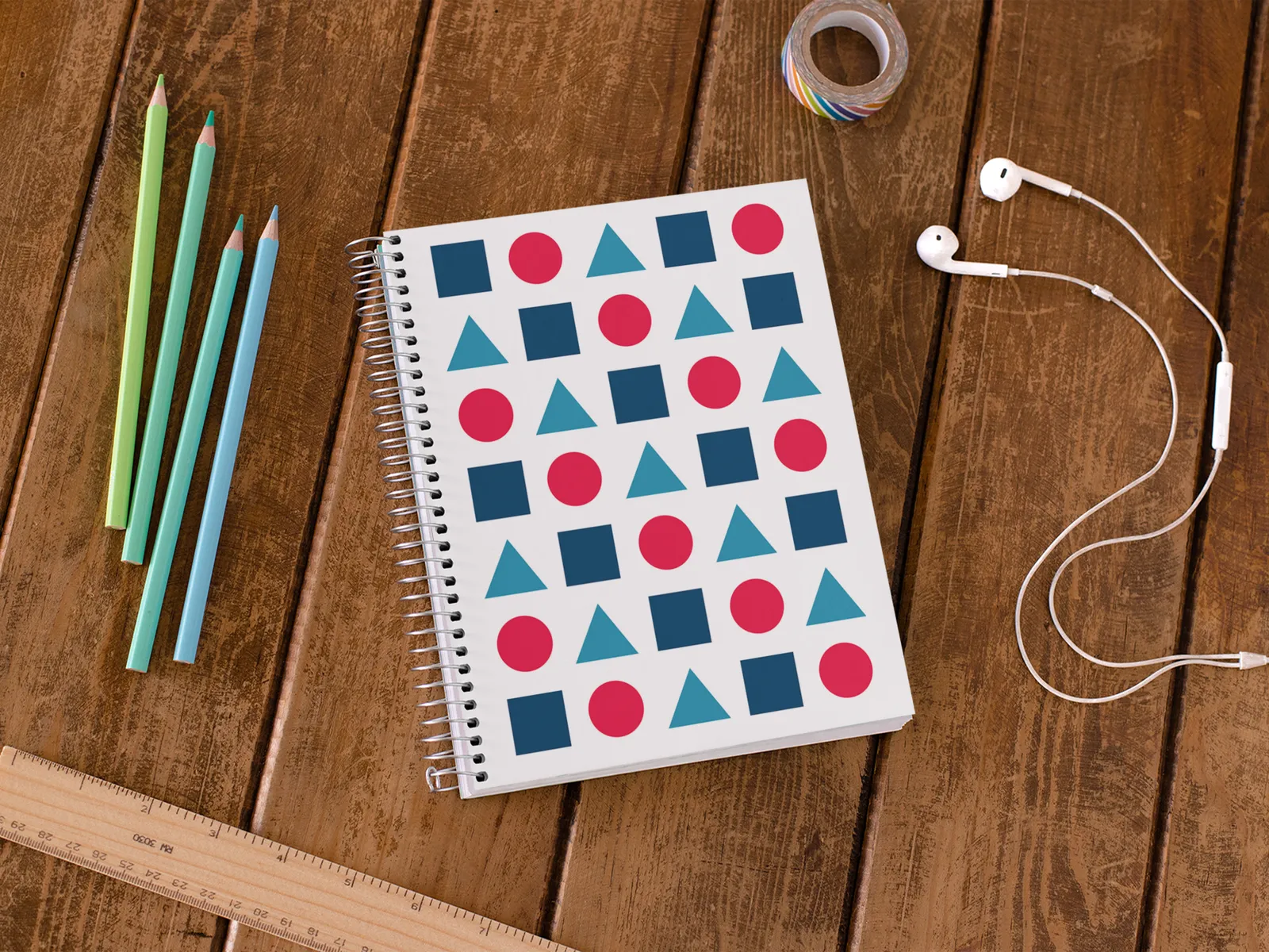
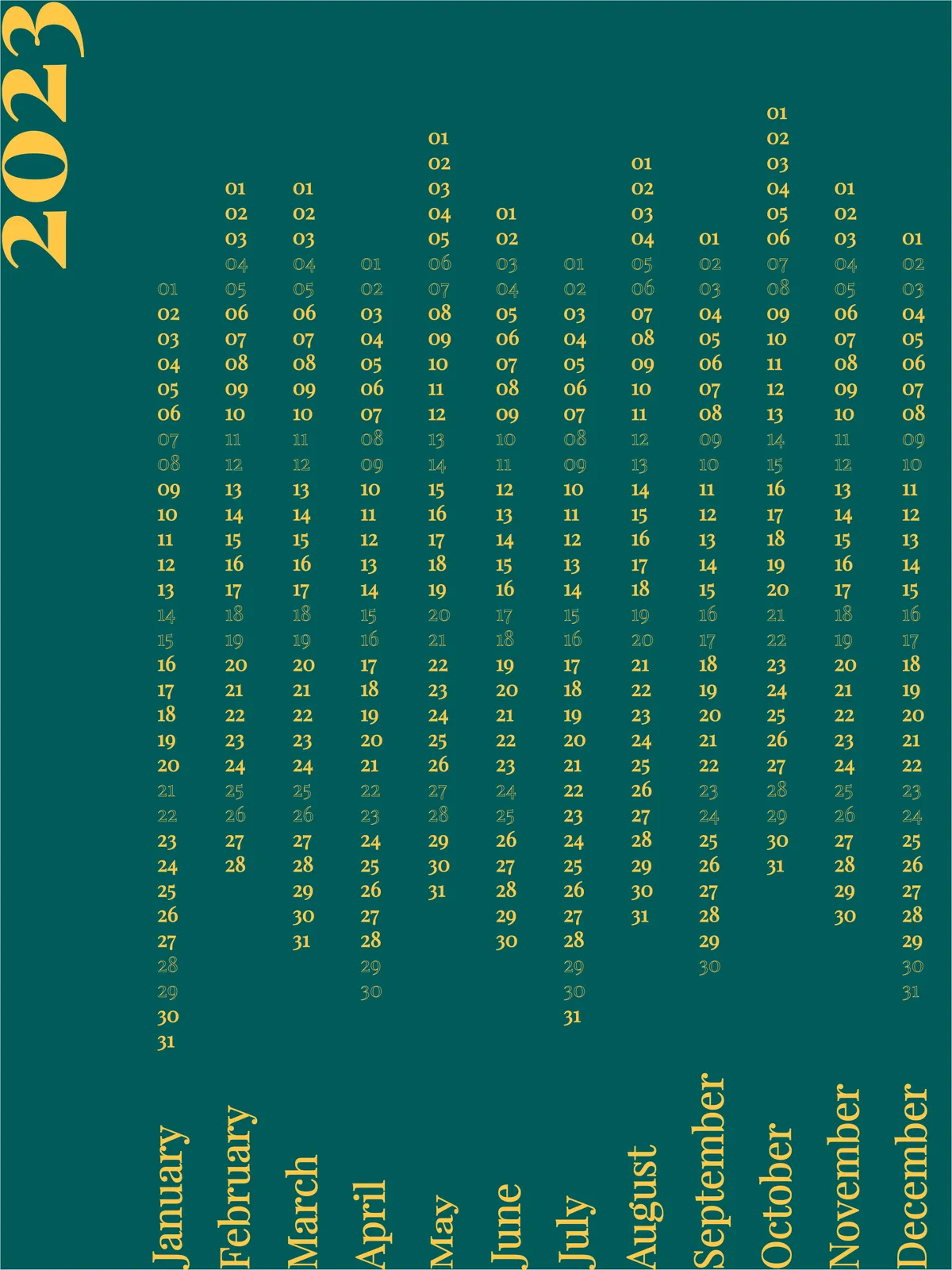
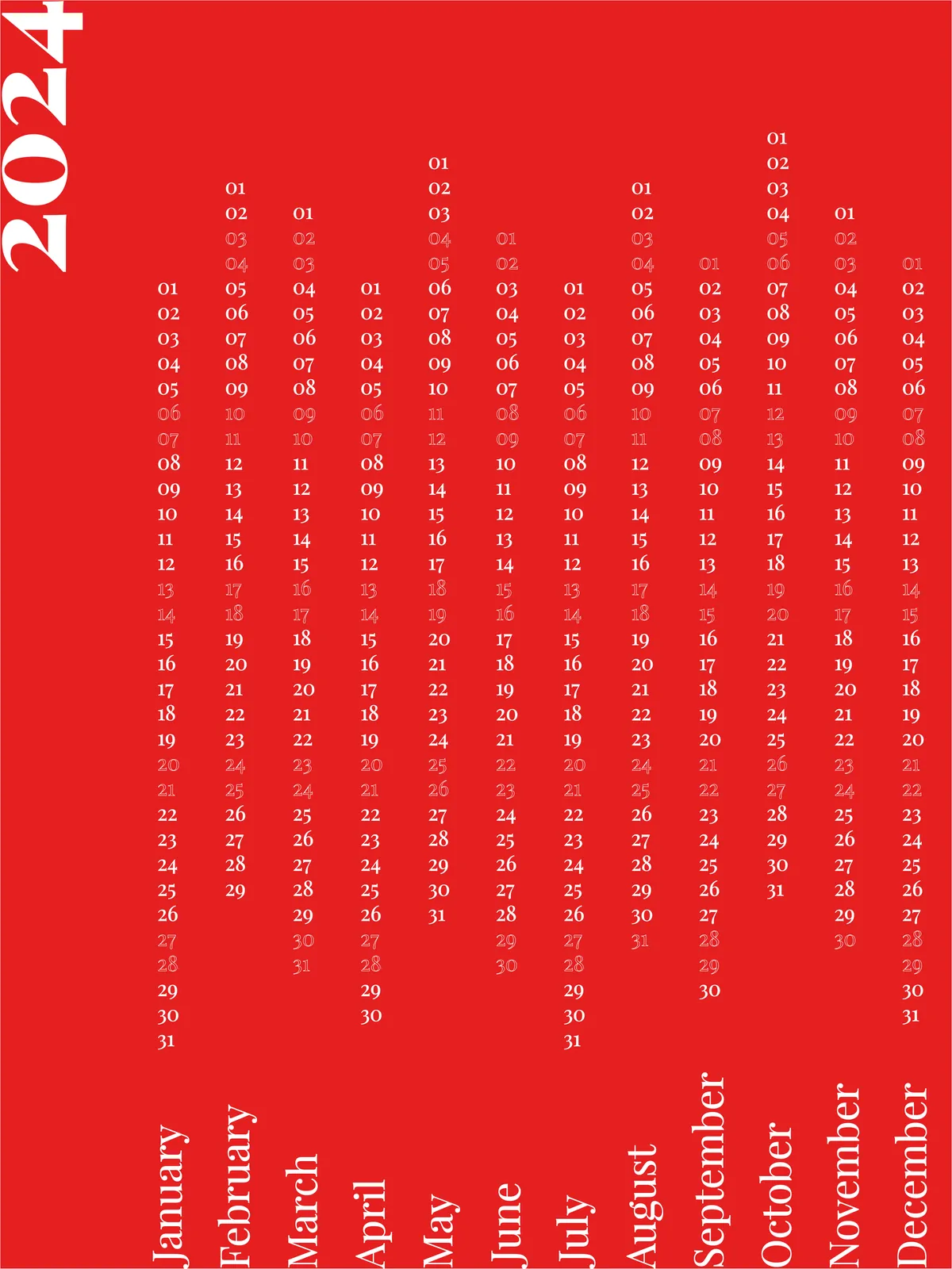
The identity rests on three pieces: the Essential Shapes pattern (a modular arrangement of circles, squares and lines used across stationery and packaging), a strict minimal typography used most visibly in the Minimal Calendar line, and a palette of architectural neutrals with seasonal accents.
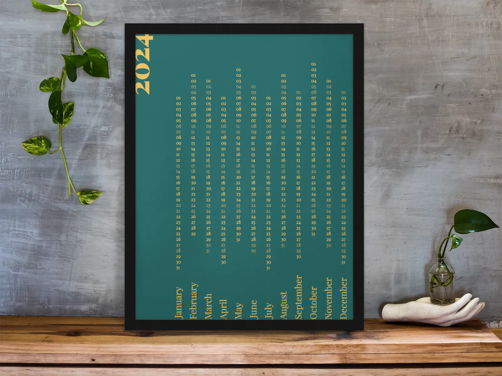
Products and touchpoints
The Outlines product line reduces homeware to wireframe geometry: tealight holders and frames in brass rod. The same language carries through to journals, phone cases and seasonal campaign graphics.

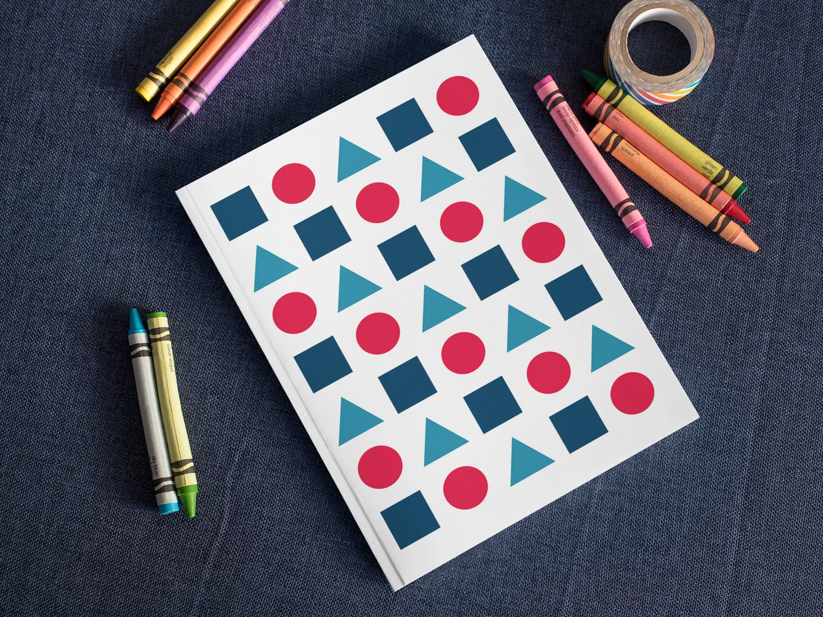

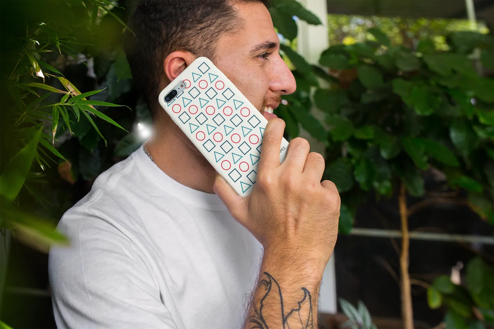
Identity system, packaging, e-commerce artwork and campaigns, all designed in-house: Illustrator, InDesign, Photoshop and the WordPress storefront.