
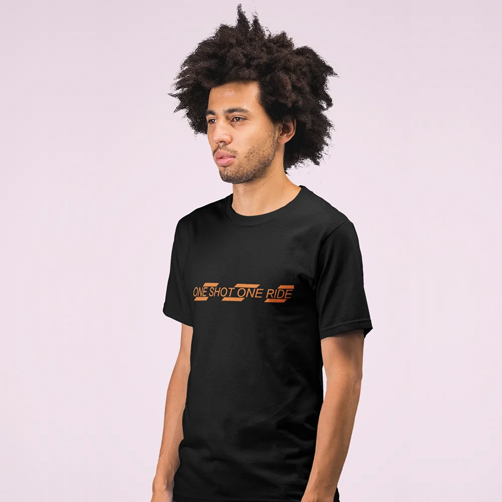
One Shot One Ride is my own urban cycling apparel brand, started in London in 2016. I designed the complete identity, from the wordmark and the signature diagonal-stripe graphic to the apparel prints, accessories, packaging and the WooCommerce storefront still trading at oneshotoneride.com.
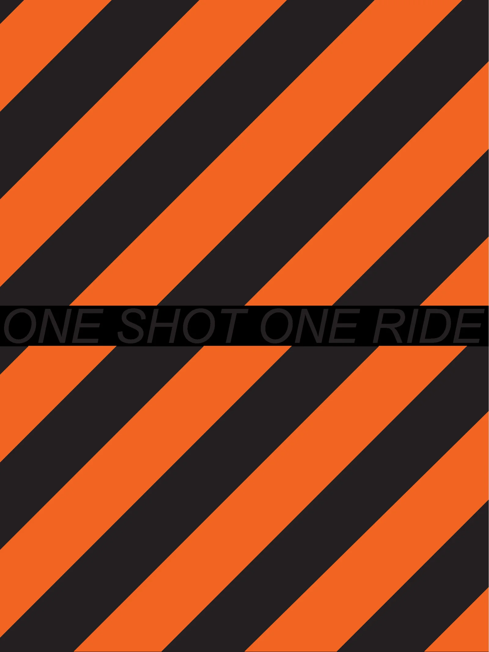
“Living life by bike”
The brand speaks to urban riders who choose their own path: quick, self-directed, curious. The identity had to read as speed and momentum at a glance, whether on a chest print, a phone case or a frame sticker.
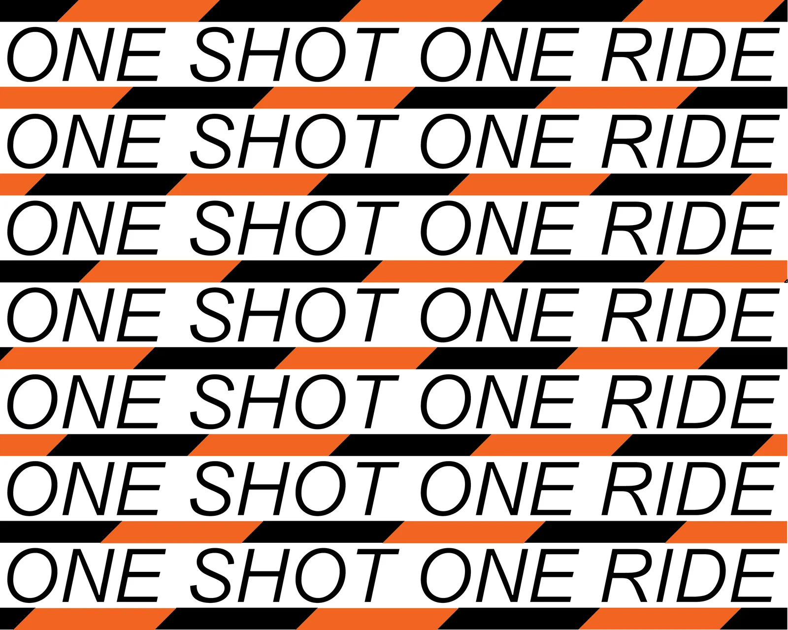
The mark & the stripes
A bold italic wordmark sets the pace, and a field of high-contrast diagonal stripes gives the brand its signature: part warning tape, part velocity. Both are vector-first, so they scale cleanly from bottle decals to large-format prints.
Colour palette
Safety Orange
HEX #F26522
High-visibility accent
Jet Black
HEX #000000
Garments, type, contrast
Ride White
HEX #FFFFFF
Negative space, light garments
On the garments
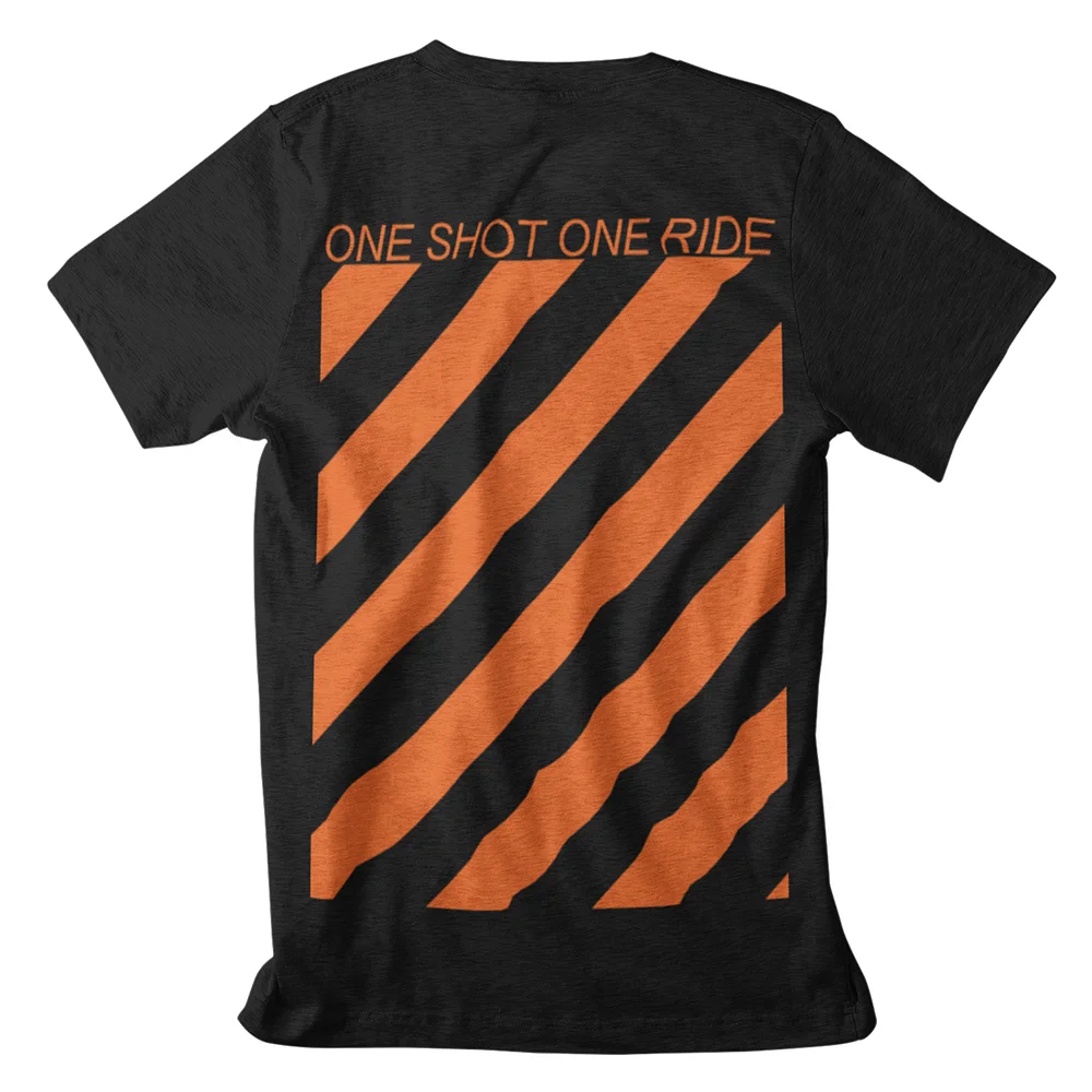
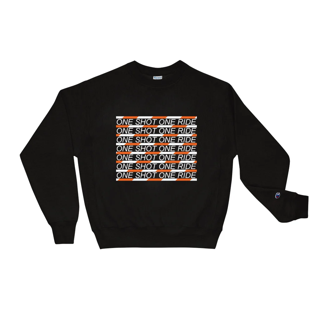
The system ran end to end: jerseys, tees, sweatshirts, leggings and joggers, phone cases, packaging, Instagram templates and the shop itself. A working brand, not a style exercise.