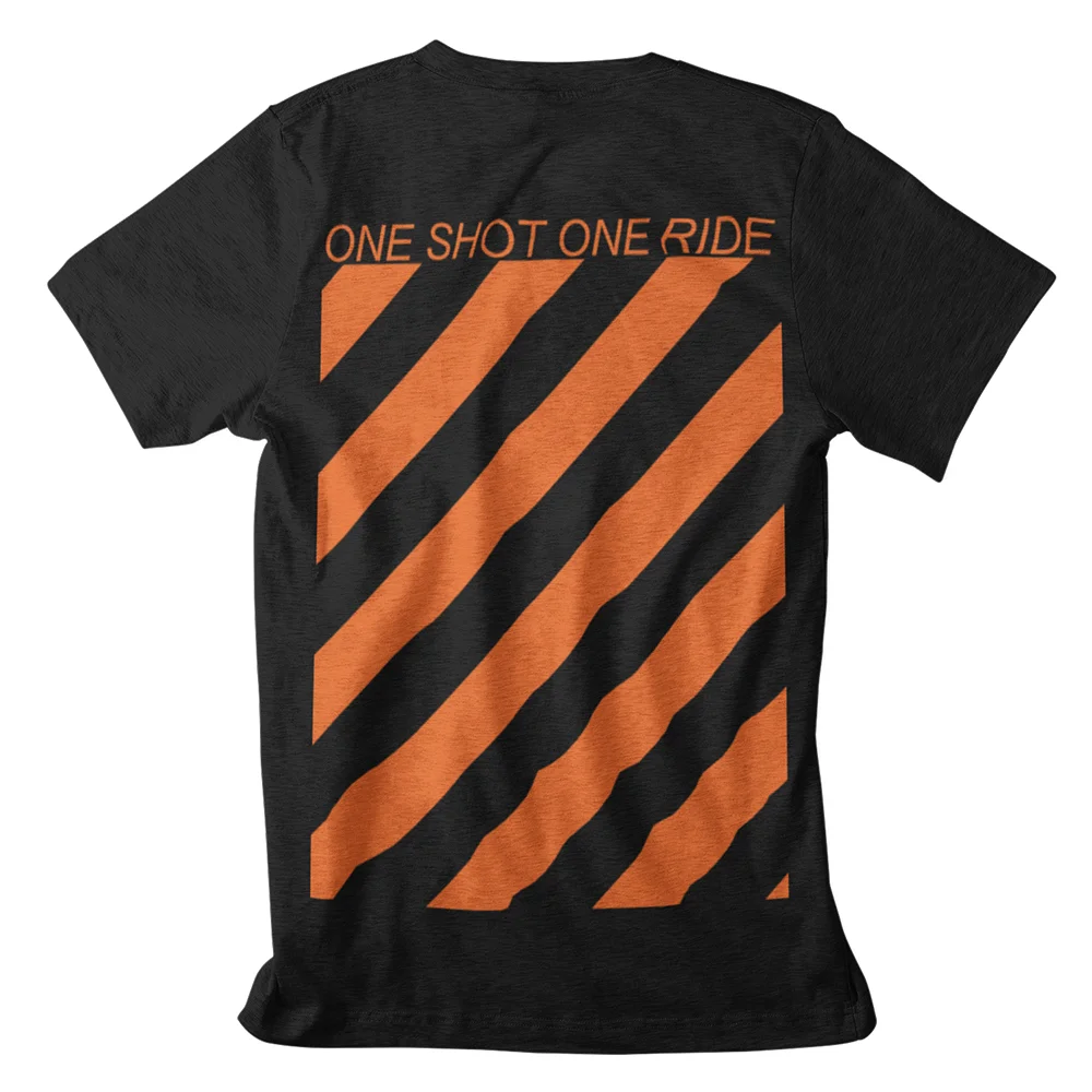
One Shot One Ride is my own urban cycling apparel brand, started in London in 2016. I designed the complete identity, from the wordmark and the signature diagonal-stripe graphic to the apparel prints, accessories, packaging and the WooCommerce storefront still trading at oneshotoneride.com.
“Living life by bike”
The brand speaks to urban riders who choose their own path: quick, self-directed, curious. The identity had to read as speed and momentum at a glance, whether on a chest print, a phone case or a frame sticker.
The mark & the stripes
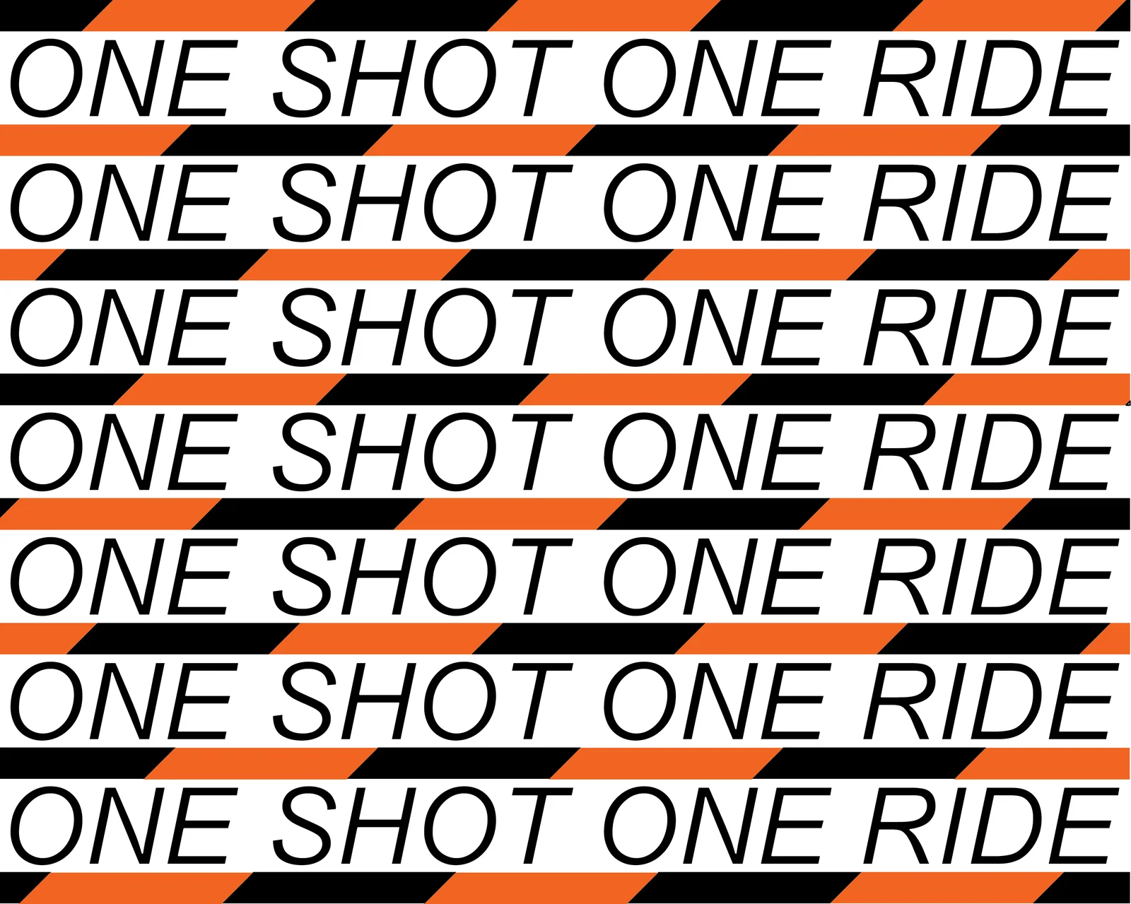
A bold italic wordmark sets the pace, and a field of high-contrast diagonal stripes gives the brand its signature: part warning tape, part velocity. Both are vector-first, so they scale cleanly from bottle decals to large-format prints.
Colour palette
Safety Orange HEX #F26522 High-visibility accent
Jet Black HEX #000000 Garments, type, contrast
Ride White HEX #FFFFFF Negative space, light garments
On the garments
The signature graphic on the back of the Urban Stripes tee.
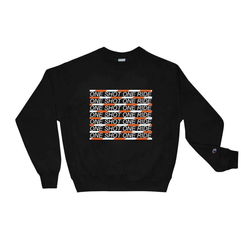
Logos-repeat block on the best-selling sweatshirt.
The OSOR repeat system: wordmark rows locked between stripe bands.
The system ran end to end: jerseys, tees, sweatshirts, leggings and joggers, phone cases, packaging, Instagram templates and the shop itself. A working brand, not a style exercise.
Goosebumps Lab was my own experimental 3D-print design studio at Hackney Downs Studios, London (2013–2015). As founder and lead designer I created the complete brand identity, from logotype and colour system to pattern language and collateral, under the tagline “Make It Real”.
The “Make It Real” ethos
A vibrant, playful spirit fused with experimental 3D-print manufacturing. The bold palette: industrial black, studio white, warm paper grey and a signature technical acid lime: brings energy to every product and collateral piece, while the geometry of the mark reflects a commitment to innovation and precision.
The mark & pattern logic
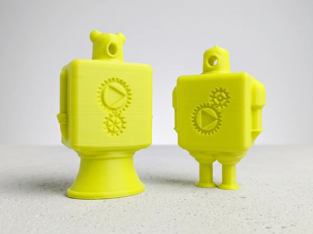
A sharp black vector mark of two interlocking gears containing triangles, symbolising collaboration and engineering. The same gear-and-triangle language generates a signature debossed pattern applied across products, packaging and collateral.
Colour palette
Core Industrial Black HEX #000000 Logotype, gear linework, display text
Studio Pure White HEX #FFFFFF Backgrounds, negative space, labels
Warm Paper Grey HEX #EDEEDE Newsprint & textured flyer stock
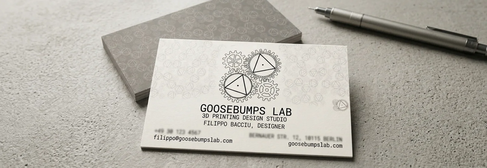
Premium matte business cards carrying the debossed gear pattern into print.
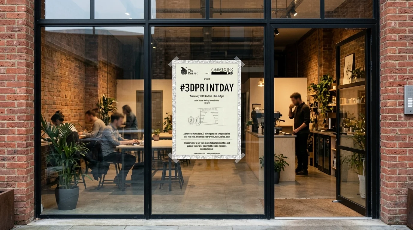
#3DPrintDay event poster at The Russet, Hackney Downs Studios.
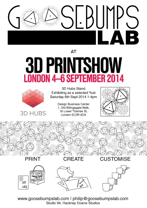
Exhibition flyer for 3D Print Show London, September 2014.
“Him & Her” 3D-printed figures in the signature acid lime.
The identity ran end-to-end across product finishes (Yo-Yo, phone cases), packaging and business cards, studio signage, event posters and the Etsy storefront: one consistent visual language from digital storefront to printed object.
This website is built the same way I approach any project I take on professionally. Since it is a showcase of my career, it felt right that the process behind it should reflect how I actually work.
I start by planning, then defining the fundamentals: colour, typography, and visual style. Once those are in place, I apply them in a modular way, building each part of the project on top of a consistent foundation. This makes every decision faster to implement, easier to keep coherent, and simpler to improve over time.
This post documents that process, one layer at a time.
The Problem
My career spans product design, digital fabrication, technical communication, education and software. That range is the point, but it is also the risk: a portfolio that lists several disciplines can read as scattered rather than broad. The site had to make a multi-disciplinary profile legible within the seconds a recruiter gives it, in English and German, on any screen size.
The answer is structure: a small set of fundamentals, applied consistently, so that breadth reads as one coherent story instead of a list of jobs.
The People It Is For
A portfolio site really serves two audiences, and it has to work for both at once. These are proto-personas: grounded in how hiring funnels actually work rather than in interview data, and open to correction if real usage data ever arrives.
The Scanning Recruiter
“Does this person fit the role I have open?”
Arrives from a CV or LinkedIn link, 30 to 90 seconds on the first pass
Needs the “what does this person do” answer instantly, then evidence
Design response: three-field positioning up top, CV and Contact always one click away
The Evaluating Peer
“Show me how you think, not just what you made.”
Second-round reviewer or potential collaborator, 5 to 15 minutes
Reads case studies properly and notices craft details as a proxy for competence
Design response: structured project stories and this documented system as meta-evidence
Both arrive cold from an external link, and both punish inconsistency. A thin post next to a polished one undermines the recruiter and the peer alike, which is why depth of evidence inside each project post matters as much as the frame around it.
The Journey
The primary journey is the recruiter’s first pass: cold entry, fast orientation, a scan through the relevant discipline, one or two projects, then a low-friction way to reach out. Mapping it against the live site surfaced the weak points honestly, from the hero that takes a few seconds to say who I am, to the missing wayfinding state on deep pages.
LinkedIn / CV link→Homepage→Design or Skills hub→Project post→CV→Contact
Primary persona: the Scanning Recruiter, a 30 to 90 second first pass deciding whether the candidate fits an open role.
Stage
1. ArriveCold entry from a link
2. OrientFirst 10 seconds
3. ExploreScanning the disciplines
4. EvaluateIs the work real?
5. Reach outConverting interest
Goal
Land on the site with a role in mind and zero prior context.
Answer “what does this person do?” within seconds.
Find the discipline that matches the open role and open a project.
Confirm there is real work and real process behind the claims.
Get in touch with minimal friction before attention runs out.
Actions
Clicks a link on a CV, LinkedIn application or referral; lands on the homepage or a deep project post.
Reads the hero statement, registers the three-field identity (Design / Communication / Education), glances at the menu.
Opens the Design or Skills hub, or scrolls Selected Projects; clicks one or two cards.
Skims a project post for visuals and structure; may open CV or this design-system post as a second opinion on craft.
Clicks the Contact CTA in the header, or copies the email or LinkedIn link.
Touchpoints
External link (CV PDF, LinkedIn, referral); EN homepage or /de/ mirror; deep project URL.
Hero headline and subtitle, header nav, the three-field band.
Design hub and Skills hub dropdowns, Works overview, homepage Selected Projects carousel.
Project post structure (featured image, role, context, outcome), CV page, the design-system case study.
Persistent Contact CTA in the header, footer links, CV download.
Pain points
The hero leads with a value statement, not a name and role; the “who” is implicit for a few seconds.
A multi-disciplinary profile can read scattered if the three-field story does not land immediately.
Thin or text-only project posts sit next to polished ones; two thin posts in a row weaken the evidence.
No wayfinding state on deep pages; a visitor entering on a post cannot see where they are in the structure.
Contact is always one click away, but a visitor with a preferred channel has to pick it from the footer links.
Opportunities
A one-line name-and-role line above the hero headline for instant orientation.
Keep the three-field band high on the page; it turns diversity into a story rather than a list.
Prioritise visuals on the highest-traffic posts first; a consistent post template makes projects comparable at a glance.
Breadcrumb or highlighted nav state on posts; a related-projects strip to pull visitors into a second case study.
Surface preferred channels directly on the Contact page, with the CV link alongside.
Journey mapped against the live site, October 2026. Lanes follow the Nielsen Norman journey map structure: goal, actions, touchpoints, pain points, opportunities.
The Map
The architecture mirrors the two audiences and the two markets. One menu, two hubs: Design groups the five disciplines, Skills groups the technical capabilities. Works and CV sit top level where recruiters expect them, Contact stays a persistent header action, and the whole structure exists twice, once per language.
The Colour Palette
The palette is built around four core colours, each playing a specific role in the visual hierarchy, with white as the accent.
#1C0F13
Coffee Bean
Primary background
#6E7E85
Slate Grey
Borders, dividers, secondary text
#B7CECE
Ash Grey
Card backgrounds, light surfaces
#BBBAC6
Pale Slate
Subtle backgrounds, tags
#FFFFFF
White
Accent: CTAs, headings, highlights
White is the accent. It appears on calls to action, key headings and interactive elements, giving the eye a clear place to land without complicating the palette.
The Type System
Four typefaces, each with one job. A display face for statements, a serif italic for voice, a workhorse for reading, and a monospace for anything technical. The theme provides the last two; the first two are layered on as overrides where a page needs more personality.
Ag
League Spartan
Display headlines, section titles
Ag
Libre Baskerville
Italic subheads, editorial voice
Ag
Manrope
Body text, interface copy
Ag
Fira Code
Hex codes, labels, technical accents
Layout and Components
Everything sits on the block theme’s grid, and the component vocabulary is deliberately small:
Header. Logo left, navigation centre, Contact call to action right, identical on every page and in both languages.
Cards. Rounded 12px corners, a soft 8px shadow, Coffee Bean text on white or Ash Grey. The same card carries project thumbnails, palette swatches and type specimens like the ones above.
Carousels. Horizontal scrolling for project galleries, so a works section can hold many pieces without a wall of thumbnails.
Custom HTML blocks. Where a component does not exist (colour cards, journey maps, this site’s sitemap), it is written as a self-contained block that inherits the palette rather than hardcoding new styles.
The Audit
After building, the site was audited against the five questions the design curriculum uses to review UX portfolios. Scores are honest, and the weakest one is there on purpose: it is the thing still being worked on.
Review question
Score
Key finding
Personal brand?
Strong
Three-field positioning, custom domain, distinctive system. Gap: hero states the what, not the who.
Navigation?
Strong
Two-hub menu, persistent Contact, full EN/DE mirror. Gap: no wayfinding state on deep pages.
Beyond the template?
Strong
Custom palette, font stack, carousels, bilingual structure, self-documenting.
Diversity of projects?
Partial
Breadth is real; depth varies. Thin posts sit next to polished ones while the asset pipeline catches up.
Responsive?
Pass
Adapts at phone width; one cosmetic defect (carousel arrows overlap card text).
Accessibility
The palette was tested pair by pair against WCAG contrast requirements. The two surfaces that carry almost all text, Coffee Bean and White, hold a 18.63:1 ratio, nearly the maximum possible. The audit did find one genuine failure:
Pair
Ratio
Verdict
White on Coffee Bean
18.63:1
AA + AAA
Coffee Bean on White
18.63:1
AA + AAA
Slate Grey on White
4.21:1
Large text only
Slate Grey on Coffee Bean
4.42:1
Large text only
Coffee Bean on Ash Grey
11.30:1
AA + AAA
Coffee Bean on Pale Slate
9.72:1
AA + AAA
The rule adopted: Slate Grey never carries normal-size text. It stays for large meta labels, dividers and decorative borders, while body-size secondary text uses Coffee Bean at reduced weight. A small constraint, but the kind that is cheap to respect when it is written down.
What Comes Next
A one-line name-and-role eyebrow above the hero headline, so the who lands before the what.
Wayfinding on deep pages: a breadcrumb or a highlighted menu state so a visitor entering on a project post can place themselves.
Deeper evidence per project: visuals, featured images and structured sections on the posts that are still thin.
The mobile carousel arrow overlap, a known cosmetic fix.
That list is the point of the tagline. A living portfolio is never finished; it is just documented honestly at each stage. This post will keep growing the same way, one layer at a time.
I established Shapes Design as a benchmark for minimal, Bauhaus-inspired home decor. This wasn’t just about selling objects; it was about curating a complete visual philosophy.
Brand DNA: Designed the core logo (Triangle, Circle, Square) and a unified graphic system for the EU and UK markets.
Product Development: Led the conceptualisation and manufacturing of multiple geometric art and furniture collections.
Graphic Design: Created all brand collateral, from high-fidelity textures to digital social assets and editorial layouts.
2. High-Performance E-commerce Engine
⚙️ The Tech Stack
Architected and launched multi-lingual storefronts across WordPress (WooCommerce) and Shopify, ensuring a seamless user experience across the UK, Italy, and Europe.
Frictionless UX
Implemented a rigorous UX/UI methodology that prioritised clarity. This data-driven redesign resulted in a **50% reduction in user support inquiries** and a significant boost in conversion rates.
3. Marketing Automation & Content Scaling
Growth was never accidental. I built a system that scaled through advanced automation and human-centric messaging.
Content & Community
Ran organic content calendars across niche communities, growing engagement and driving high-intent traffic without traditional ad spend.
Klaviyo & Retention
Architected complex email flows and retention campaigns, turning one-time buyers into loyal brand advocates through personalised storytelling.
Affiliate & SEO
Managed affiliate networks and implemented long-tail SEO strategies to maintain a high “Organic Search” presence for minimalist keyword clusters.
4. Operational Excellence & Strategic Management
Beyond design, I managed the business from the ground up, ensuring financial viability and supply chain resilience.
Business Setup & Funding: Managed the initial setup and secondary funding rounds to sustain studio operations and growth.
Legacy Relationships: Negotiated supplier contracts and sourcing strategies for high-quality sustainable materials.
Logistics: Built the inventory management and delivery system for a complex international supply chain (UK ↔ EU).
Pricing Strategy: Developed a tiered pricing model that balanced brand prestige with aggressive market competitiveness.
5. UX Case Study: Customer Journey Map
To keep UX methodology at the centre of the store, I mapped the end-to-end purchase journey on the live shop at shapes-design.com. The map follows a visitor from discovery to post-purchase across a configurable, print-on-demand catalogue, and converts observed friction into a prioritised improvement list.
A wide catalogue can make the first step unclear; the brand story sits one click deep on the About page.
The same artwork appears on many product types, so grid thumbnails can look repetitive across 14+ pages.
Price displays as a range until a variant is chosen; buyers must imagine the item in their own space.
Shipping cost and delivery time only become concrete at checkout.
Print-on-demand lead times can be unclear, which weakens delivery confidence.
Opportunities
Stronger hero CTA and featured-collection entry; dedicated landing pages for seasonal campaigns.
Dual navigation: shop by product type or by artwork; collection badges to break up the grid.
Room-scene mockups, variant thumbnails that update the preview, reviews surfaced higher on the page.
Free-shipping threshold with a progress bar, guest-first checkout, express payment buttons.
Cross-sell the same artwork on other product types, review request email, loyalty incentive.
Journey mapped against the live store, October 2026. Lanes follow the standard Nielsen Norman journey map structure: goal, actions, touchpoints, pain points, opportunities.
User Flow: From Browse to Order
The same journey as a screen-by-screen wireframe flow: six key screens of the store, the decision points between them, and the save-for-later loop that brings visitors back to the product page.
Key Findings
Variant selection is the decisive moment: every product is a configurable design (size, format, framing), so the variant picker carries more weight than any other UI element.
Wishlist and Compare are the retention loop: in a browse-heavy catalogue, saving for later matters more than search.
Seasonal categories are the strongest acquisition entry: Halloween, Christmas and Back to School deserve dedicated landing-page treatment.
Two mental models coexist: shoppers think by artwork and by product type, while the navigation optimises for product type only.
Exploring the Collections
Stay tuned for deep dives into my specific geometric and furniture design projects.
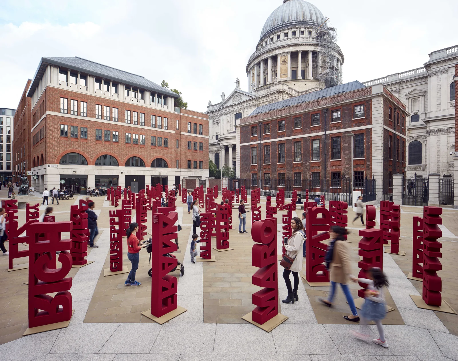
Working with Paul Cocksedge Studio required a unique blend of structural intuition and rigorous project management to bring world-renowned art installations to life.
Advanced Fabrication: Led the production of complex structural forms using CNC foam cutting, laser-cut acrylic, and precision metal welding.
Operations & Logistics: Revolutionized the workshop workflow by implementing comprehensive material inventories and digital spreadsheets for project tracking.
Material Mastery: Applied a multi-disciplinary approach across moulding, carpentry, and professional spray painting to achieve high-fidelity finishes on public art projects.
2. The Art of Digital Manufacturing
Structural Innovation
Executed large-scale polystyrene structures using custom CNC pathways, ensuring mathematical precision in organic, flowing forms.
Hybrid Craft
Sublimated the line between industry and art, integrating automated processes with handcrafted refinement for global gallery and public exhibition standards.
Precision in Public Space
My tenure at Paul Cocksedge Studio was defined by the challenge of scaling intricate digital designs into durable, monumental public statements.
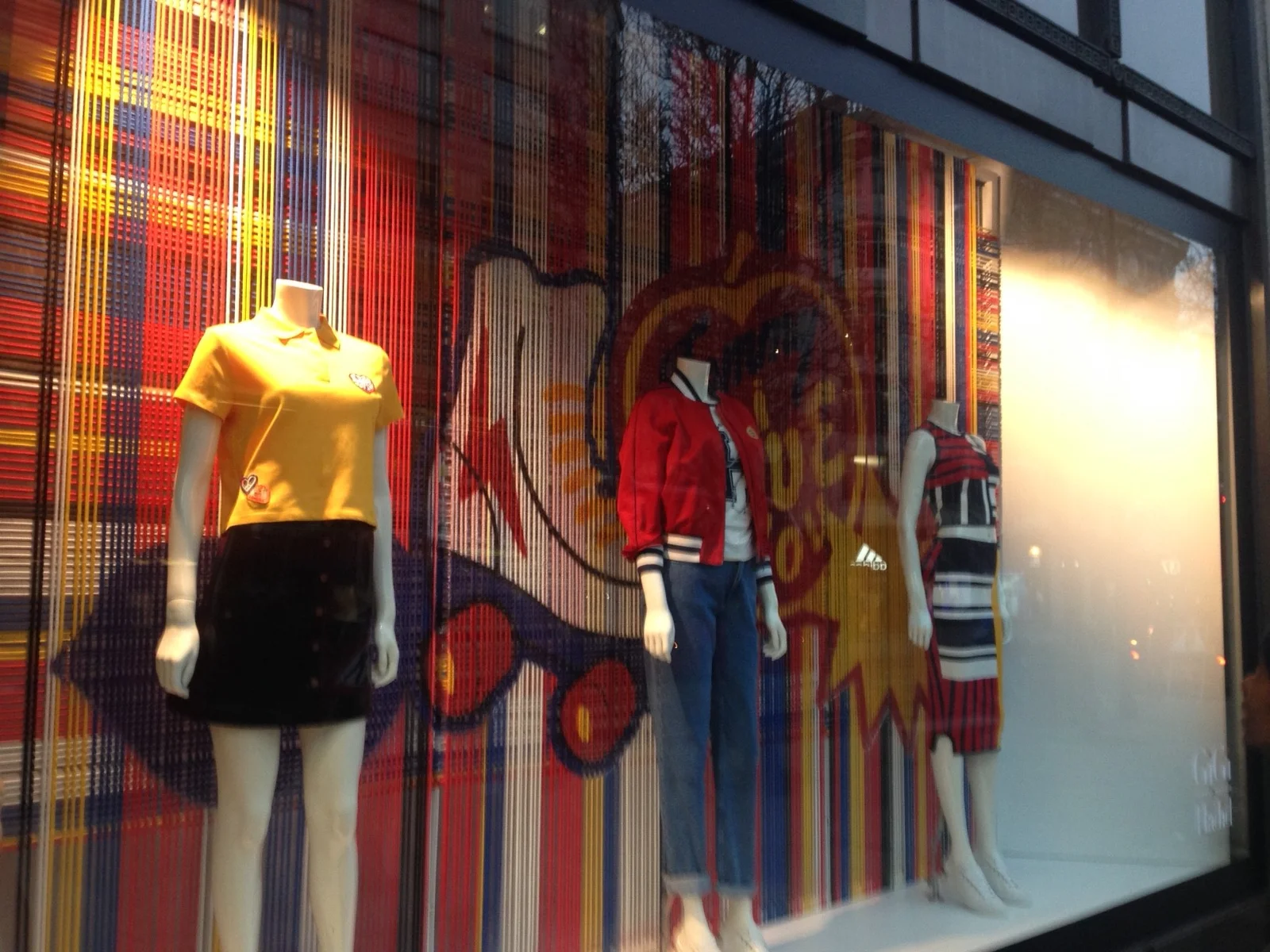
At Souvenir Scenic Studios, I translated theatrical and commercial concepts into structural blueprints, ensuring that every artistic vision was backed by technical feasibility.
Technical Draughting: Produced high-fidelity drawings for site installations, window displays, and complex architectural set elements for the London stage and retail sectors.
Strategic Production: Evaluated high-level designer concepts to determine the most efficient manufacturing paths, leveraging the specific equipment and technical expertise of the studio staff.
Documentation & Inventory: Generated detailed assembly instructions and material inventories, streamlining the communication between the design office and the production workshop.
2. Commercial Estimation & Bidding
Proposal Architecture
Architected project proposals including detailed costings and delivery timelines, ensuring commercial viability for high-stakes retail and scenic projects.
Feasibility Audits
Conducted thorough feasibility audits on upcoming projects, identifying potential structural risks and optimizing fabrication techniques to meet tight installation deadlines.
The Geometry of Spectacle
My work at Souvenir Scenic Studios reinforced my ability to manage the technical and financial complexity of large-format architectural installations for the global stage.
Working with industry giants like **Fendi** and **Harrods**, I transformed complex design concepts into tangible, high-fidelity physical realities.
CNC Mastery: Led the programming and operation of advanced CNC machinery, delivering structural components with sub-millimetre precision.
Manufacturing Strategy: Evaluated creative designs from a production perspective, optimizing material use and assembly workflows without compromising aesthetic intent.
Advanced Draughting: Produced comprehensive technical drawings, assembly instructions, and materials inventories for large-scale retail installations.
2. Prototyping & 3D Visualization
High-Resolution R&D
Managed dedicated 3D design labs, utilising additive manufacturing (3D Printing) to rapidly iterate and test bespoke luxury components for flagship stores.
Technical Integrity
Ensured the technical integrity of all deliverables, coordinating directly between design teams and on-site production workshops to meet the rigorous standards of global luxury brands.
Luxury at Scale
This experience solidified my expertise in technical draughting, CNC production, and high-fidelity 3D modeling for the world’s most demanding environments.
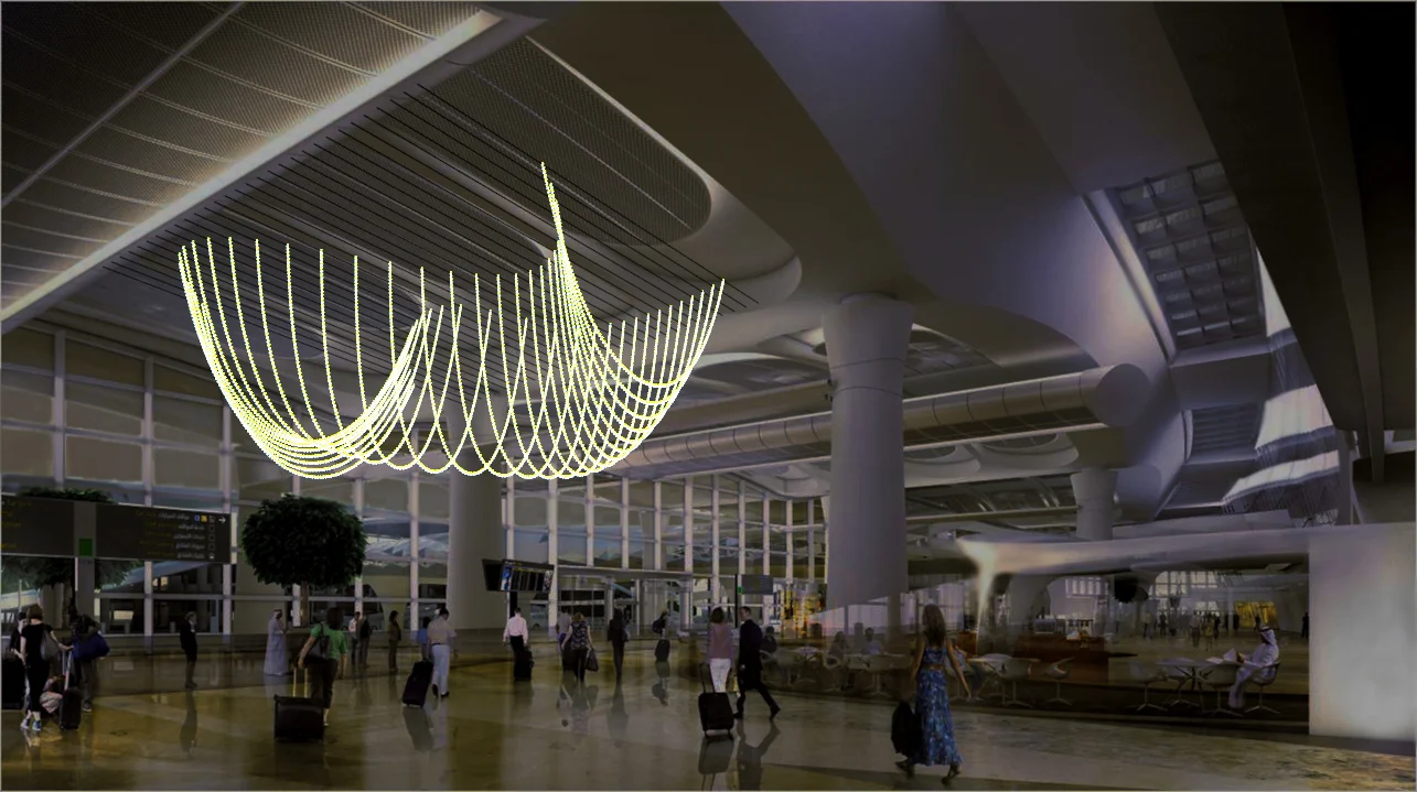
Working at Studio Waldemeyer placed me at the cutting edge of wearables and artistic technology, where I helped bridge the gap between complex mechanics and high-fashion aesthetics.
The Jamiroquai ‘Automaton’ Helmet: Contributed from ideation to production for the iconic kinetic helmet worn by Jay Kay. This project required precise integration of mechanical segments and LED electronics.
Parametric Design Sculpture: Designed and developed algorithmically-driven sculptures for a major client installation, leveraging computational design for physical form.
Kinetic Systems: Created bespoke mechanical systems for a concept project involving movement and ceiling-mounted hanging rings.
2. Advanced Fabrication Toolkit
Digital Prototyping
Utilised a rapid-iteration cycle of 3D printing and laser cutting to test kinetic components and structural integrity before final assembly.
High-Tech Assembly
Applied precision CNC milling and expert soldering techniques to integrate delicate electronic components into wearable and structural art.
Where Art Meets Electronics
My time at Studio Waldemeyer was a masterclass in the intersection of engineering and artistic vision, resulting in some of the most recognizable kinetic designs in modern pop culture.
Founder • Product Designer | London | Dec 2013 – Oct 2015
1. Pioneering 3D Manufacturing
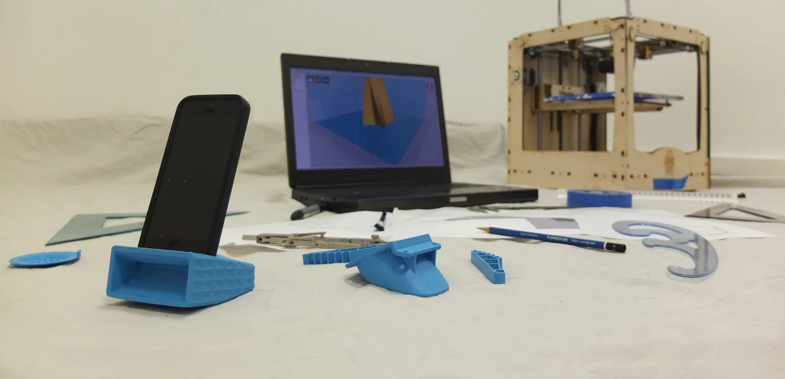
As the founder of Goosebumps Lab, I established an innovative 3D design studio focused on high-quality, additive consumer products and high-resolution CAD/CAM services.
Lab Infrastructure: Orchestrated the setup and day-to-day operation of an industrial FDM 3D printing lab, including maintenance, hardware upgrades, and precision part replacement.
Full-Cycle Product Design: Managed the entire product journey—from conceptual sketches and 3D modeling to structural testing and final market-ready fabrication.
Global Service Delivery: Successfully scaled services via international platforms like 3DHubs.com, managing client relations and bespoke technical requirements for global projects.
2. Business Strategy & Growth
Operations Management
Managed critical business cash flows, developed comprehensive multi-year business plans, and architected the operational scaling strategy for the lab.
Market Integration
Optimised product listings and digital marketing strategies to capture market share in the rapidly growing 3D-printed home accessories and parts sectors.
The Future of Craft
My tenure at Goosebumps Lab was a formative journey in entrepreneurship, where I combined technical 3D expertise with robust business management to deliver innovative consumer solutions.
Product Designer Consultant | London | Mar 2014 – Aug 2014
1. Digitalizing Heritage
During my consultancy at Mica Gallery, I was tasked with modernising traditional Islamic geometric art, converting intricate hand-drawn sketches into high-fidelity digital landscapes.
Vector Pattern Synthesis: Systematically converted complex Islamic pattern sketches into precise digital vector versions, ensuring mathematical perfection and scalability.
Product Collection Development: Transformed these patterns into sixteen distinct concept products, spanning ninety-six different versions across home decor and architectural accents.
3D Visualization: Provided high-end 3D models and photorealistic visualisations of the products within curated interior environments to drive gallery sales.
2. Exhibition Design & Showcase
100% Design Showcase
Led the technical preparation for the collection’s showcase at the prestigious 100% Design exhibition during the London Design Festival.
Spatial Layouts
Designed integrated product-and-interior simulations that demonstrated the versatility and cultural impact of the geometric collection.
Tradition Reborn
My tenure at Mica Gallery demonstrated my unique ability to respect traditional artistic heritage while leveraging cutting-edge digital tools to create scalable luxury products.
Sales assistant at Topshop’s Oxford Circus flagship, one of the busiest high-street retail floors in London. Beyond the till, the role meant living inside a brand: how it presented itself, how customers read it, and what made them buy.
Flagship retail operations: Day-to-day sales on the floor of the Oxford Circus store, one of the highest-traffic fashion retail environments in the UK.
In-store brand management: Responsibility for a brand sold inside the store, keeping its presentation and stock in line with both the label’s identity and Topshop’s floor standards.
Customer-facing communication: Product advice and brand storytelling translated into plain, useful language for real customers.
2. Clothing Label Design
The design output of this period: clothing labels for the in-store brand I managed. Small format, strict constraints, real production, the kind of brief where every millimetre and every letterform has to earn its place.
Label artwork: Designed clothing labels for a brand managed inside the store, from layout to production-ready artwork.
Brand consistency: Kept the label system coherent across items while working within garment production constraints.
Retail context: Designed from the floor, not from a distance: the labels had to work on the rack, in the hand, and at the till.
An early intersection of retail experience and graphic design practice: selling the brand by day, and literally designing what went on the clothes.
Working under the mentorship of Matteo Tessera and Valerio Vinciguerra, I gained valuable insight into the fast-paced world of Italian branding and visual communication.
Visual Identity Support: Contributed to the development of modern brand identities for regional clients, ensuring scalability and aesthetic consistency across media.
Digital Asset Production: Assisted in the creation and optimization of vector graphics, ensuring high-fidelity layouts for both print and digital platforms.
Studio Workflow: Developed an early understanding of studio operations, including project pipelines, client asset management, and technical documentation standards.
2. Technical Craft & Collaboration
Vector Precision
Mastered the fundamentals of vector synthesis, creating clean and versatile icons and logos for diverse commercial industries.
Design Ethics
Embraced the core principles of effective visual communication, focusing on clarity, impact, and user-centric design solutions.
The Italian Design Legacy
My internship at Alkimia SNC provided a critical foundation in the visual language of design, fostering a career-long dedication to precision and aesthetic excellence.
Technical Collaborator | Italy | Apr 2010 – Aug 2012
1. Technical Draughting & Compliance
In collaboration with Architect Francesco Trisorio, I provided essential technical support for complex residential and commercial projects, ensuring every blueprint met rigorous construction standards.
Architectural Master Drawing: Produced comprehensive technical drawings and structural layouts, focusing on precision, spatial efficiency, and regulatory compliance.
Design Consultation: Actively collaborated on the conceptual development of interior spaces, selecting materials and finishes that balanced aesthetic vision with structural feasibility.
Field Surveys & Audits: Conducted detailed on-site surveys and technical audits to inform the development of high-fidelity restoration and renovation plans.
2. Bringing Vision to Life
Spatial Problem Solving
Resolved complex structural and spatial challenges within historic and modern Italian contexts, providing innovative solutions for residential layouts.
Material Integrity
Advised on the selection and technical integration of materials, ensuring durability and high-end aesthetic finishes in accordance with the project vision.
Structural Narrative
My collaboration with Architetto Francesco Trisorio honed my technical rigor and architectural intuition, creating a strong foundation for my subsequent work in large-scale structural design.